Willi Smith’s designs presented new takes on elevated basics with a mission to make fashion accessible and affordable to everyone. His democratization of fashion echoed key values of modernism, which aimed to bring good design to the masses, but Smith’s production of interiors, events, and performances broke down traditional hierarchies of high and low art in a playful manner that was decidedly new.


Willi Smith Street Couture
The Willi Smith: Street Couture Virtual Exhibition illuminates how American designer Willi Smith (1948-1987) and his collaborators broke down social, cultural and economic boundaries by marrying affordable, adaptable “street couture” with avant-garde performance, film and design.
Your journey so far
Loading...
All pages
Your journey so far
Fashion
Alvin Bell
Community, Fashion, Person
Artist T-Shirt by Dondi White
Fashion, Image
Artventure
Fashion, Image Story
Attitudes
Fashion, Image Story
Audrey Smaltz
Community, Fashion, Person
Beginnings and Career
Fashion, Timeline
Bethann Hardison
Community, Fashion, Person
Bethann Hardison Oral History
Fashion, Video
Bonnie Brownfield
Community, Fashion, Person
Brian Howard
Community, Fashion, Person
Cesar Moreno
Community, Fashion, Person
Christa D’Souza
Community, Fashion, Person
Christine Rucci
Community, Fashion, Person
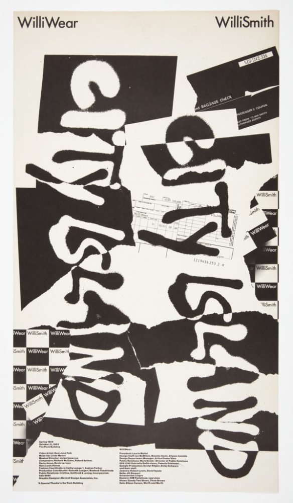
City Island
Fashion, Video
Elyn Rosenthal
Community, Fashion, Person
Jeff Tweedy
Community, Fashion, Person
Jeffrey Banks
Community, Fashion, Person
Jon Haggins
Community, Fashion, Person
Joseph Delate
Community, Fashion, Person
Juan-Manuel Alonso
Fashion, Image Story
Kelvin Garvanne
Community, Fashion, Person
Knowledge through the Hand
Fashion, Essay
Laurie Mallet
Community, Fashion, Person
Laurie Mallet Oral History
Fashion, Video
Map Print Skirt
Fashion, Object
Mark Bozek
Community, Fashion, Person
Martha Nutt
Community, Fashion, Person
Menswear Illustrations
Fashion, Object Group
Mindy Grossman
Community, Fashion, Person
Miralda’s Dressing Tables
Fashion, Detail
Pat Cleveland
Community, Fashion, Person
Patterns for You
Fashion, Image Story
Peter Goldfarb
Community, Fashion, Person
Prudence Harvey
Community, Fashion, Person
Reba Ford-Sams
Community, Fashion, Person
Shailah Edmonds
Community, Fashion, Person
Sightseeing
Fashion, Video
Spring 1979 WilliWear Presentation
Fashion, Image
Stephen Burrows
Community, Fashion, Person
Stuart Lazar
Community, Fashion, Person
Style over Status
Fashion, Essay
The Greatest Showman
Fashion, Image Story
To Be American
Fashion, Essay
Tsia Carson
Community, Fashion, Person
Uniform Shirt and Pants, The Pont Neuf Wrapped
Fashion, Object
Veronica Jones
Community, Fashion, Person
Vijay Agarwal
Community, Fashion, Person
Wedding Dress for the Black Fashion Museum
Fashion, Essay
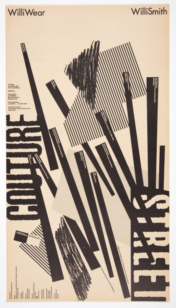
Williwear to Streetwear
Fashion, Essay
Community
Southern Voice—February 15, 1990
Community, Image Story
About Willi Smith
Community, Essay
Alvin Bell
Community, Fashion, Person
Anthony Barboza
Community, Person
Artist T-Shirts and Prints
Community, Object Group
Audrey Smaltz
Community, Fashion, Person
Bethann Hardison
Community, Fashion, Person
Bill T. Jones Oral History
Community, Performance, Video
Bonnie Brownfield
Community, Fashion, Person
Brian Howard
Community, Fashion, Person
Carla Moore
Community, Person
Cesar Moreno
Community, Fashion, Person
Cheryl Braunstein
Community, Person
Christa D’Souza
Community, Fashion, Person
Christine Rucci
Community, Fashion, Person
Christopher Andrews
Community, Person
Cynthia Stubbs-Hill
Community, Person
Diane Meier
Community, Performance, Person
Edwin Schlossberg
Community, Person
Elyn Rosenthal
Community, Fashion, Person
Fern Mallis
Community, Design, Person
Forest Young
Community, Person
Groom’s Suit
Community, Object
Ian Hylton
Community, Person
Iris Simpson
Community, Person
Jack Travis
Community, Design, Person
Jackie Sanchez
Community, Person
Janette Beckman
Community, Person
Jeff Tweedy
Community, Fashion, Person
Jeffrey Banks
Community, Fashion, Person
Jon Haggins
Community, Fashion, Person
Jorge Socarras
Community, Performance, Person
Joseph Delate
Community, Fashion, Person
Just (Some) Friends
Community, Detail
Kelvin Garvanne
Community, Fashion, Person
Kim Hastreiter
Community, Design, Person
Kim Steele
Community, Person
Laurie Mallet
Community, Fashion, Person
Les Levine
Community, Film, Person
Linda Mason
Community, Performance, Person
Loren Harrison
Community, Person
Lynne Tillman
Community, Image
Mark Bozek
Community, Fashion, Person
Martha Nutt
Community, Fashion, Person
Mary Jane Marcasiano
Community, Person
Max Vadukul
Community, Film, Person
Mindy Grossman
Community, Fashion, Person
Om Batheja
Community, Person
Pat Cleveland
Community, Fashion, Person
Patrick Patterson
Community, Image Story
Paul Tschinkel
Community, Film, Person
Penny Payne
Community, Film, Person
Peter Goldfarb
Community, Fashion, Person
Peter Gordon
Community, Performance, Person
Peter McQuaid
Community, Person
Prudence Harvey
Community, Fashion, Person
Reba Ford-Sams
Community, Fashion, Person
Sabrina Lahiri
Community, Person
Sarah Khan
Community, Person
Shailah Edmonds
Community, Fashion, Person
Stacey Appel
Community, Person
Stephen Burrows
Community, Fashion, Person
Stuart Lazar
Community, Fashion, Person
Sylvia Waters
Community, Person
Todd Siler
Community, Image Story
Tom Healy
Community, Person
Tsia Carson
Community, Fashion, Person
Vernaculars of Black and Queer Remembering
Community, Essay
Veronica Jones
Community, Fashion, Person
Veronica Webb
Community, Person
Vicente Wolf
Community, Design, Person
Vijay Agarwal
Community, Fashion, Person
Wendy Goodman
Community, Person
Willi Smith and Friends Poolside, 1976
Community, Image
Willi Smith: On the Record
Community, Video
Willi Smith: Swervin’ in the Kingdom of Dreams
Community, Essay
Willi Smith’s Glasses
Community, Object
X Baczewska
Community, Person
Performance
Secret Pastures
Performance, Video
Secret Pastures Collaborator Portrait
Performance, Detail
Take-Off from a Forced Landing
Performance, Video
A Closer Look at Secret Pastures
Performance, Image Story
Bill T. Jones on Secret Pastures
Performance, Essay
Bill T. Jones Oral History
Community, Performance, Video
Costume Illustration for Cotton Club Gala
Performance, Object
Costumes for Take-Off from a Forced Landing
Performance, Object Group
Diane Meier
Community, Performance, Person
Feast or Fashion
Performance, Essay
Illustrations and Costumes for Deep South Suite
Performance, Object Group
Jorge Socarras
Community, Performance, Person
Linda Mason
Community, Performance, Person
Peter Gordon
Community, Performance, Person
Publicity Photograph of Bernadine Jennings and Leon Von Brown
Performance, Image
Real Clothes for Real Dance
Performance, Essay
Film
Expedition
Film, Video
Expedition Detail Image
Film, Detail
Expedition Film Screening Ticket
Film, Object
Expedition Press Kit and Invitation
Film, Object Group
Expedition Screening at Ziegfeld Theatre
Film, Image
Future Crossings
Film, Essay
Les Levine
Community, Film, Person
Max Vadukul
Community, Film, Person
On Set of Expedition
Film, Image Story
Paul Tschinkel
Community, Film, Person
Penny Payne
Community, Film, Person
Ruth E. Carter on School Daze
Film, Essay
Design
WilliView Maquette
Design, Object
Bill Bonnell for WilliWear
Design, Object Group
Dan Friedman for WilliWear
Design, Object Group
Design for Willi Smith
Design, Essay
Fern Mallis
Community, Design, Person
Jack Travis
Community, Design, Person
Kim Hastreiter
Community, Design, Person
Loft on Lispenard Street
Design, Detail
Polydisciplinary Magnetism
Design, Essay
Poster, WilliWear Fifth Avenue Store
Design, Image
Rebellion in Design: Developing a Blueprint for the Future
Design, Video
SITE Drawings
Design, Image Story
SITE’s Iconic Ghost Cityscape
Design, Essay
Vicente Wolf
Community, Design, Person
Willi Smith In Pieces
Design, Essay
WilliWear Map Print
Design, Detail
WilliWear New Wave Graphics
Design, Essay
WilliWear Showroom
Design, Detail